• Good old’ McDonalds. From its founding in the 40s to our modern day, the fast food joint has stood the test of time. It’s not common that a company’s iconography alone can be recognized international as a key symbol of America. If it’s for better or for worse is a discussion for another day, what matters is how the company through its many decades stayed relevant while also telling its story that correlates with America itself.

    To begin we need to understand that brands, even big ones, aren’t guaranteed immortality. It takes a considerable understanding on the world around you to not only win an audience but also keep up with the constant change of time. As decades change so do the customs, Blockbuster was once a household name but in the 2020s it’s something of the past. And while McDonalds is an older brand it had the luxury of being a fast food restaurant instead of evolving technology, their marketing department still needed to find clever ways to keep the name in the mind of all Americans.

    From its creation, in order to win over the new unfamiliar crowd they promoted what the core of McDonalds is, food made fast and cheap. And it worked! But advertising your fast food gimmick doesn’t work when competitors also adopt a similar concept. So with the country being familiar with the food, why not push the narrative that McDonalds was something special in America by showcasing it as a place for families and fun. Throughout the 70s to 90s, the selling point went beyond food, but also fun. The development of mascots, happy meals, and play places encouraged kids to beg their parents to become repeat customers. Ronald McDonald and his crew became a staple within themselves, having cartoons and video games made to promote the brand.
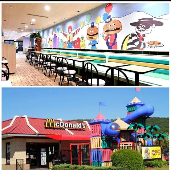
    A child’s dream!

    While it was a genius part of the research and developers, there comes a point where your marketing can feel a little stiff. Sure McDonalds was still a juggernaut, but showcasing the same place the same way can get old. It’s not replacing what doesn’t need fixing, instead, it’s presenting the same but in a fresh new way. Through the 2000s we’ve shifted away from a place of imagination and now have a more modern and mature looking place. Where, yes children could have their happy meals, but there was more of a focus on the adults. Quick breakfast, coffee, there was no time for play place or colorful interior. By this time America was also shifting from the late 20th century, a focus on minimalism and people become most distant through technology. And the worst part: it appeared that the Ronald McDonald crew was phased out for these terrifying looking demon spawns, mainly because the Minions were popular at the time so everyone wanted to make their own version.
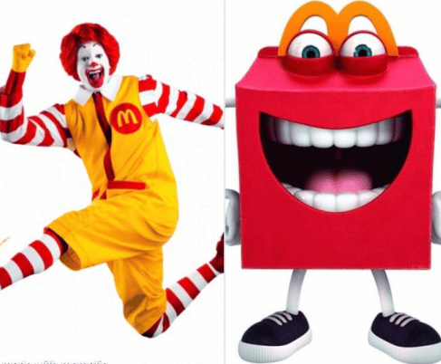
    From uncanny clowns to uncanny boxes.

    However in modern day, our society have been looking back at those distant days and remembering what we have forgotten. And the marketing team has took note, there has been a push from McDonalds to bring back classic characters while giving them a “viral twist”, the example coming to head was the whole Grimace Shake event. Alongside the every now and then McRib return, this style of marketing solely relies on the brand they created so long ago that people would automatically recognized when they bring it back up.

    Throughout the many years, we seen America and McDonalds change side by side: through the popularization of fast food, to marketing places as imaginative for the wholesome American family, to the rise of minimalism, and the modern day of remembering the past. Its very clever, the restaurant is in a position where it has become a staple of the nation itself so whenever we as a society change, McDonalds will be there to capitalize on it.

    Extra Thoughts: I guess the story of McDonalds will never end until America does, or maybe it’ll even outlive it. That’s an interesting concept.
  • Walking across San Jose at night changes when you’re specifically searching for advertisements on signs and billboards. They’re integrated into our society to the point where we don’t even spot a second eye to someone asking we buy their stuff. I walked all across the city and was looking for something that interested me the most. I was hungry unfortunately, so the main things that got my eyes were the food advertisements on the Paseo. There has been an uprise in minimalism and even AI, which I will like to discuss.

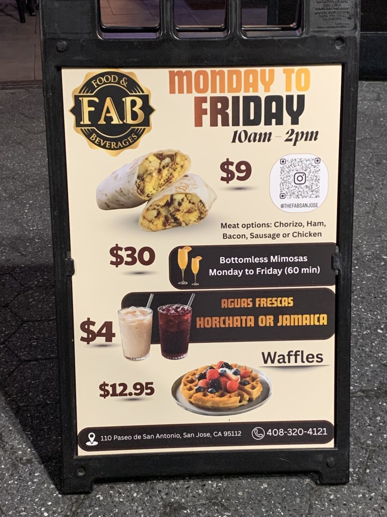
    To start, here’s an advertisement showcasing The FAB’s Monday to Friday’s deal.

    Now I have never been here unlike a lot of the places in the Paseo, probably because I’m not 21 yet. Although my birthday is on the 14th of September, so maybe this sign interested me for the future. Tangent about drinking aside, the advertisement uses logos, it’s very direct, showcasing prices of various breakfast items to start off the day. As well as a bottomless mimosas, which caught my eye.

    It’s interesting how it’s a sale that takes place on the weekdays and not the weekends; I would assume that people going to these kinds of places would want to do it on their days off. To add to the oddity, the deal is from 10am-2pm, where most students would be busy. Now I’m wondering if this ad is targeted towards students who are on their break, looking for a small treat. Afterall they do advertise on a different board that SJSU students get a discount. Or if it’s a person who’s schedule is later than usual so they have time to drink and chill.

    Now the composition of the whole thing is a mixed bag for me. I believe they’re trying to go for a minimalist look to showcase their place for mainly adults looking for a drink. However, I don’t know if this is just my overexposure to AI around me, but there’s some uneven-ness to the image. It may be the odd looking shadows, or the whole thing looking like a Canva template (I tried making stuff in that site and it’s similar to this). Despite my criticism, it’s still to the point and showcases their weekday deals.

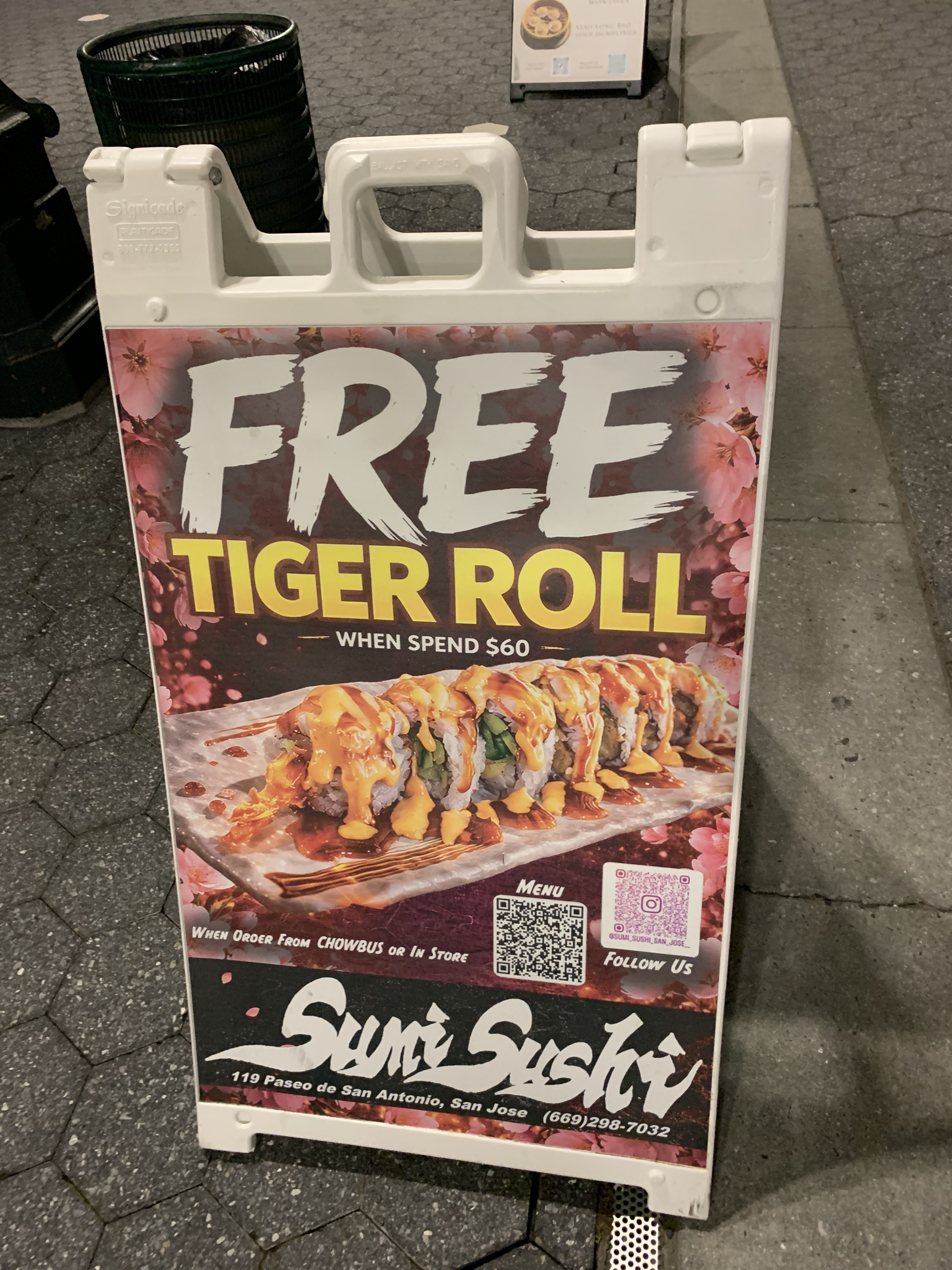
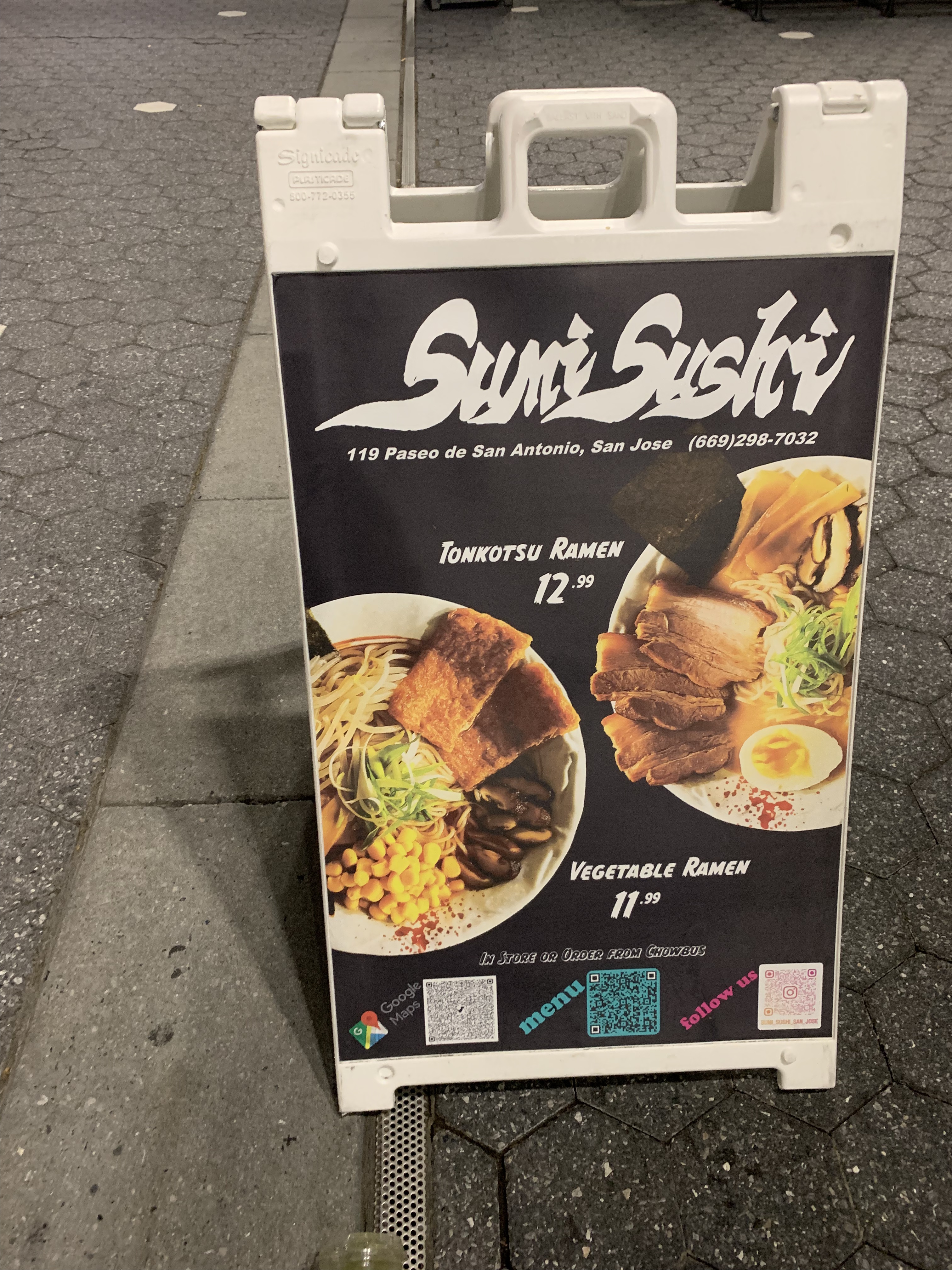
    For the second advertisement, it’s for Sumi Sushi, which I actually went to earlier the day I took the walk. Because they had two different signs, one handmade (or I hope so). And one that was clearly done with AI. Can you guess which one is which?

    Okay enough being rude, I’ll start with the one on the left. It’s very basic and simple. A black background with white text, including multiple QR codes, with mismatching colors and fonts. Alongside two genuinely good deals, no seriously the ramen’s price for its quality. The goal of the ad is simple, to showcase the two bowls clearly and with little distractions. And it worked for me, that entire bowl for the same price of a waffle at FAB? I’m set.

    Now the other sign for the same restaurant screams AI to me. It doesn’t help that about half of the signs in the Paseo block were AI generated but once you see one you can’t really not see it. The “hand drawn” FREE, the shiny tiger roll font, is grammatically incorrect. It feels very hastily made to me and wouldn’t win me over if I haven’t had the place before. To give them some points, they must’ve used an actual picture of the sushi rather than generating it itself. Online there have been many examples of AI generated food. All looking unnerving or trypophobic at worst.

    I guess the main takeaway from here comes from the ad’s respect for its viewer. Even the most simple of designs can reel me in. Well, and also if the deal is any good. But while hungry, an unappealing sign can drive me away and choose another place to eat. The average person already has their favorite spots, so it’s important for these signs to win over new people.

  • Hello World!

    Welcome to WordPress! This is your first post. Edit or delete it to take the first step in your blogging journey.